16 Candlestick Patterns To Know
Japanese candlestick charts present traders with a great depth of information and provide different visual cues that allow traders to better understand price action and spot Forex patterns more clearly.
Forex candlestick patterns are used by traders to identify trading opportunities and predict which direction the price will move in next. In this article, we will share 16 of the most common candlestick patterns for you to look out for when trading and also provide an example of a Forex candlestick patterns strategy!
Table of Contents
Forex Candlesticks Explained
What is a candlestick? The 'body' of the candle comprises the difference between the opening and closing price, and the lines on either side – referred to as the shadow or wick - represent the highest and lowest prices of the time period.
Generally speaking, if the Forex candle body is black or red, then the closing price is lower than the opening price - this is referred to as a bear candle.
On the other hand, a white or green body indicates that the closing price is higher than the opening price and is referred to as a bull candle.
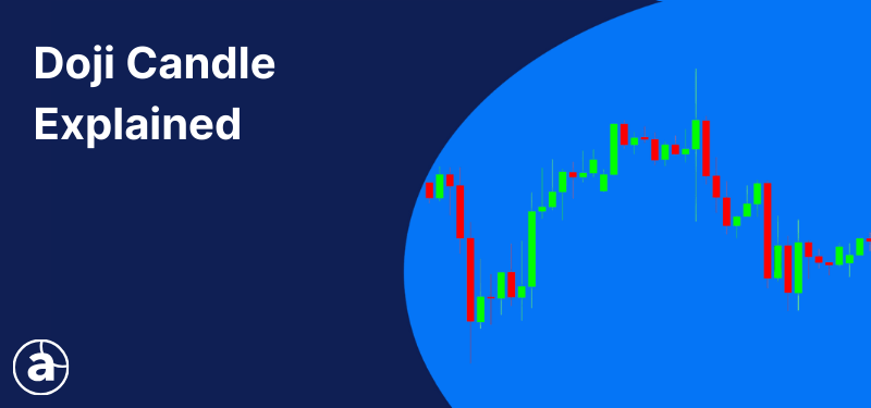
A candlestick which closes where it opened, or very close to where it opened, is called a Doji candle. A Doji candle indicates a struggle between buyers and sellers which, ultimately, results in neither side winning.
By understanding and looking at Forex candlestick patterns, traders can get an idea of momentum, direction, now-moment buyers or sellers, and general market bias. In the remainder of this article, we will share some of the most common candlestick patterns.
8 Forex Candlestick Patterns to Know
Forex candlestick patterns occur very often in the Forex market, here is a list of some of the most common and easiest to spot:
- Marubozu Candle
- Hammer Candle
- Shooting Star Candle
- Hanging Man Candlestick
- The Piercing Line
- Dark Cloud Cover
- Engulfing Candles
- The Master Candle
Of course, there are many more Forex candlestick patterns besides these, but, in this article, we will be paying attention to the most popular ones.
The Marubozu Candle
A Marubozu candle is a strong momentum Forex candlestick pattern, which usually occurs at support or resistance levels. The Marubozu candle has either no, or a tiny, wick on either side and indicates strong selling-off resistance or strong buying support.
Bullish Marubozu Candle
A bullish Marubozu candle appearing in an uptrend may suggest a continuation of the current trend whilst, in a downtrend, it can indicate a potential bullish reversal.
Here is an example of a bullish Marubozu candle:
Bearish Marubozu Candlestick
Conversely, the bearish Marubozu candlestick appearing in a downtrend may suggest its continuation, while in an uptrend, a bearish Marubozu candlestick can signify a potential bearish reversal pattern.
Here are some examples of bearish Marubozu candles:
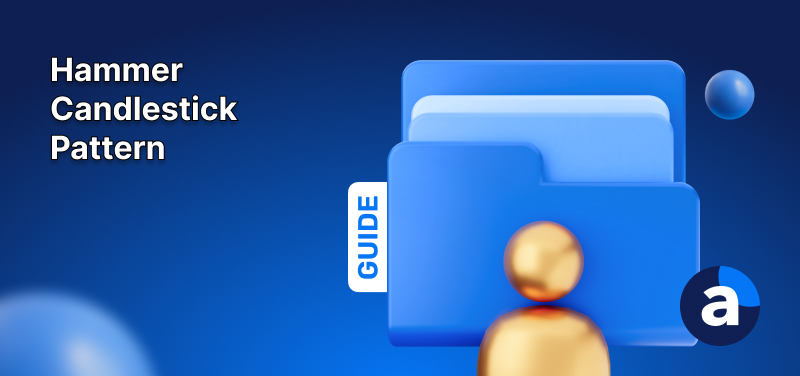
The Hammer Candle
The Hammer candlestick has a long lower shadow, which is usually at least twice the length of the body, and a short body. It is a bullish reversal candlestick pattern which appears at the bottom of downtrends.
The hammer candlestick pattern tells us that, despite strong selling pressure during the session, ultimately, the buyers took control and forced the price upwards.
The hammer candle body can be either bullish or bearish, but it is considered to be a stronger signal if it's bullish.
The Shooting Star Candle
The Shooting Star candlestick appears in uptrends, signifying a potential reversal. Looks wise, it is essentially the opposite of the Hammer candlestick, with a long upper shadow and a short body.
The Shooting Star candle body can be either bullish or bearish, but it is considered to be stronger if it is bearish.
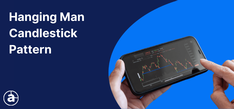
The Hanging Man Candlestick
The Hanging Man candlestick looks the same as the Hammer, with the difference being that is happens at the top of an uptrend and signifies a potential bearish reversal.
Like the Hammer, the Hanging Man candlestick pattern shows us that there was selling pressure during the session, which was eventually overcome by the buyers, who successfully pushed the price back up.
However, during an uptrend, this Forex candlestick pattern is often viewed as a sign that buyers are beginning to lose control of the market and, therefore, that a reversal may be about to take place.
The Piercing Line Candlestick
The Piercing Line is a bullish reversal candlestick pattern and, as with the other candlestick patterns examined in this article, it tends to occur often in the Forex market.
This candlestick pattern is identified when a bullish candle follows a bearish candle. The second, bullish candle must close above the middle of the first bearish candle’s body.
Usually, the bullish candle will also open lower than the bearish candle’s close; however, in the Forex market, the pattern is still valid - although not considered as strong - if the second candle’s open is equal to the first candle’s close.
The Dark Cloud Cover Candlestick
The Dark Cloud Cover candle is a bearish reversal pattern that appears in uptrends and is essentially the opposite of the Piercing Line candlestick.
The pattern consists of two candlesticks, a bullish candle followed by a bearish candle. The second candle opens above the close of the first candle but then drops and closes below the halfway point of the first candle’s body.
As with the Piercing Line, in the Forex market, the Dark Cloud Cover candlestick is considered valid even when the second candlestick opens at the close of the first candlestick.
The important thing, however, is that the second candle in this Forex candlestick pattern should close somewhere lower than the 50% mark of the first candle's body.
Engulfing Candles
Bullish and bearish engulfing candlestick patterns consist of two candles and indicate a potential reversal. Bullish engulfing candles usually occur at the bottom of a downtrend, whilst a bearish engulfing candle is spotted at the top of an uptrend.
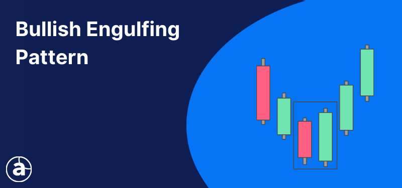
Bullish Engulfing Candle
The bullish engulfing candlestick is characterised by the two candles, the first of which is bearish and contained within the body of the second candle – which is always bullish.
Here is an example of a bullish engulfing candlestick pattern:
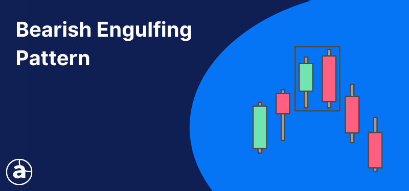
Bearish Engulfing Candle
The bearish engulfing candlestick pattern is also characterised by two candles. The first one is bullish and contained within the body of the second candle, which is always bearish.
Here is an example of a bearish engulfing candlestick pattern:
The Master Candle
The Master candle is one of the Forex candlestick patterns which is known to many price action traders. The Master candle is defined by a 30-150 pip candlestick that engulfs the next four candlesticks.
The breakouts of the Master candle can be traded if the 5th, 6th or 7th candlestick break the range in order for a breakout trade to become valid.
This is a Forex candlestick pattern that you can check for on a regular basis when trading. In the next section, we will provide an example of how a candlestick pattern strategy can work when trading Forex.
Candlestick Pattern Strategy
The conditions for this Forex candlestick pattern strategy are as follows:
- Indicators: Exponential Moving Average (EMA) 30, 60 & 100 - set on close
- Entry signal: Identification of Forex candlestick patterns
- Time frame: H4
First, we need to add three EMAs to our candlestick chart. In the example in the graph below, EMA 30 is blue, EMA 60 is red and EMA 100 is green.
All three EMAs must be aligned properly to show a trend. When the blue EMA is below the red EMA, which is below the green EMA, the trend is bearish. When the blue EMA is above the red EMA, which is above the green EMA, the trend is bullish.
For example, the USD/JPY chart below shows an example of an uptrend:
Please keep in mind that the EMAs need to be aligned correctly in order to show the trend. If the EMAs are intertwined, it means that we don't currently have a trend.
Once a trend is established, entries are made when the price makes a pullback towards the EMAs. When we see a pullback, the next thing that occurs is the emergence of bullish or bearish candlestick patterns, depending on the trend direction.
Entries are made on any of the following Forex candlestick patterns, none of which is more reliable than the other:
- Hammer
- Shooting Star
- Hanging Man
- Piercing Line
- Dark Cloud
- Bullish/Bearish Engulfing
The stop-loss in this example is placed 10 pips below/above the entry candle. For targets, we recommend using the Admiral Pivot (available exclusively with MetaTrader Supreme Edition) set on 'Weekly Timeframe'.
Bearish Trade Example
Bullish Trade Example
It is usually better to wait for a pullback to at least touch the blue EMA before making an entry decision.
The above is just an example of a trading strategy which could be implemented using Forex candlestick patterns, but you can also use the information from this article to create your own candlestick patterns strategy!
It is also important to remember that even the top trading strategies are unlikely to succeed without proper risk management techniques.
Trade on a Risk-Free Demo Account
As well as risk management, it is always recommended to practise any new trading strategy on a demo account before making the transition to the live markets. A demo account allows you to practise trading in realistic market conditions using virtual currency.
By doing this, you allow yourself to make mistakes, learn from them and fine-tune your candlestick patterns strategy without jeopardising your capital! Click the banner below to open your free demo account with Admirals today:
Continue reading...
- Doji Candlestick Pattern
- Bullish Candlestick Patterns
- Morning Star Candlestick Pattern
- Bearish Candlestick Patterns
- Evening Star Candlestick Pattern
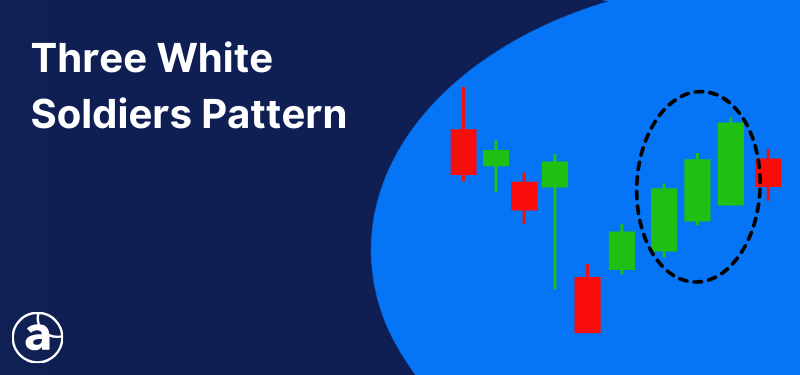
- Three White Soldiers Candlesticks
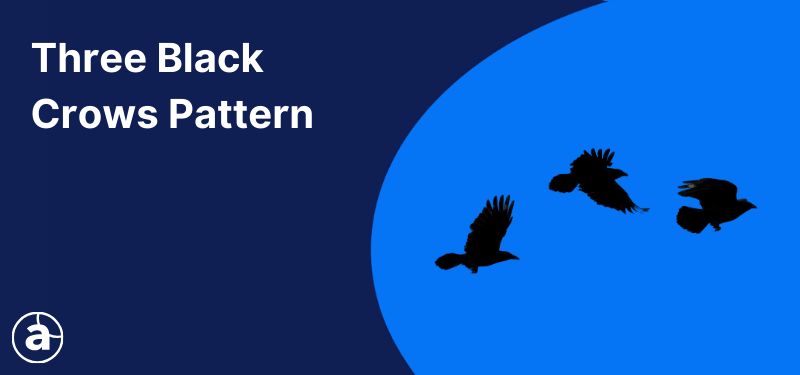
- Three Black Crows Candlesticks
- Spinning Top Candlestick Pattern
- Reversal Candlestick Patterns
FAQs on Candlestick Patterns
How to read candlestick patterns?
A candlestick pattern shows the open, close, high and low price levels of a fixed period of time. The body of the candle is the difference between the open and closing price. A black or red body indicates it closed lower than where it opened. A white or green body indicates it closed higher than where it opened. The lines above and below the body of the candle are referred to as wicks and represent the highest and lowest price levels during the time range of the chart you are on (5 minutes, daily, etc).
Is candlestick patterns enough for trading?
As trading the financial markets is about probabilities, many traders use candlesticks with other analysis tools as well. This could be a technical analysis overbought or oversold indicator or fundamental analysis. Using candlestick patterns, along with support and resistance levels and other analysis tools can provide a strong combination to aid in trading decisions.
Does candlestick pattern analysis really work?
Yes, candlestick pattern analysis really does work as a candlestick merely tells you what has happened to price during a particular time period. However, when using candlestick patterns for trading, then more analysis is required to identify how far a market could move to then identify the top stop loss and take profit levels to exercise proper risk management.
Which candlestick pattern is most reliable?
There are many different candlestick patterns available to traders. The reliability of each one depends on how the trader uses them and their ability to use them in the right market conditions. Some of the commonly used candlestick patterns include Marubozu Candle, Hammer Candle, Shooting Star Candle, Hanging Man Candlestick, The Piercing Line, Dark Cloud Cover, Engulfing Candles and The Master Candle.
About Admirals
Admirals is a multi-award winning, globally regulated Forex and CFD broker, offering trading on over 8,000 financial instruments via the world's most popular trading platforms: MetaTrader 4 and MetaTrader 5. Start trading today!
This material does not contain and should not be construed as containing investment advice, investment recommendations, an offer of or solicitation for any transactions in financial instruments. Please note that such trading analysis is not a reliable indicator for any current or future performance, as circumstances may change over time. Before making any investment decisions, you should seek advice from independent financial advisors to ensure you understand the risks.